Thursday, 15 March 2012

Renaissance Impetus: Substituting "Quantity" for "Quality"

My ferocious Landsknecht Maximilian Pike Block. The army list is circa that of the Great Italian Wars Supplement (upgrades). The Pike is only three ranks deep, it looks more as I have used the maximum number of figures (see below) becase I had them and I thought it looked impressive. The Pike are protected by two sleeves of "Trained" Harquebusiers to their flanks and a line Doppelsolders "Skirmish" but with Impact (3), to the front. The Doppelsolders job is to chase away enemy skirmishers with a fierce charge and clear the way fro the Pike to charge. The Pike Block is still the heart and soul of this Renaissance killing machine I call my own. I nominated the Pike Block to be where my General is. (It seemed a safe enough sort of place, what could go wrong? H does needs a special "representative" figure though).


To the left of the infantry mass is a screen of Crossbow "Skirmish" protecting my proud Burgundian Knights and to the far left my newest acquisition, the "Four Horsemen of the Apocalypse", a unit of Light Horse, Mounted Crossbowmen (see below). Very pretty they looked too, we'll see how they perform, I have a theory regarding pretty painted units on a wargames table and "dice".


On a hill to the right of the Pike stands my "Big Cannon" (that old Games Workshop plastic classic and soon to have the Artillery based filed out with a second cannon, just to look good - no more combat dice). Next to it comes a ferocious unit of Germanic Men-At-Arms (MAA). They MAA have reasonable/respectable Impact and combat dice, but have great staying power being a "deep" unit (causalities transfer to the back and the front rank retains its "impetus" dice in combat). Flanking them to the right is a small band of merry Harquebusier armed "Skirmish", essentially the end of my line on the right flank (see below).


The Renaissance camp placed (nay hidden) behind the hill. Dubbed a mixture of saint and sinner. "Heaven" is nearest with a Monk and "Nun", contrasting with "Hell" and a Lady "G-Spot" figure that came from an old subscription to Wargames Illustrated when Duncan MacFarlane was running the show. This is another area where the appearance of the Renaissance army can be "improved" on. I plan to add drunks, harlots, casks of wine, surgeon's tent etc. I'll have to take a look at Redoubt Enterprises and Irregular Miniatures for some choice offerings.
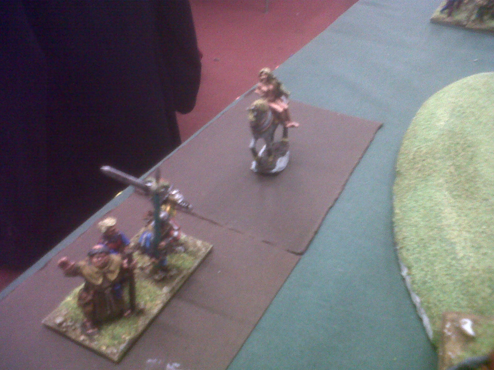

Albeit via the Blackberry here is a close up of my current favorite Renaissance sons, the said "Four Horsemen of the Apocalypse" showing a certain eagerness to get forward (see below):   


Having said the above, I still have great affection for my Burgundian Knights in their blue and whites (nothing to do with football colours I may old). Trouble is that I always seem to throw them in too soon and they consequently get ground down rather than generate sweeping devastation (see below):


For all the dash of the Burgundian Knights you still have to admire or rather respect the staying power of the Germanic MAA and their deep formation (see below) as they keep going in stoic fashion: 


I hope you will sense that this Renaissance Band has bulked out with some more units, courtesy of successful painting tray action, and is slightly less stacked with powerful upgrades which previously restricted its frontage too much IMHO. As you might tell I have high hopes for this outing, will the fickle goddess of fate be kind on my martial endeavours?

Painting Table: Deck Cleared

The panzers have pushed off now which leaves the strange feeling of space on the blessed painting tray (see below):


Something Renaissance beckons, the Holy Roman Emperor (HRE) Charles V (courtesy of Redoubt Enterprises), his horse and Paige (see above and below):


I also have a second Games Workshop "Empire Great Cannon" to add to my Renaissance artillery park before my next Impetus game in two weeks time.

Tuesday, 13 March 2012

GHQ Panzer IV H's in Battalion Strength

Here we come:


Walking down the street:


Get the funniest looks:


From everyone we meet:


Hey, hey we're the Mark IV's: 


People say we 'panzer' around:


But we're too busy upgrading:


To let incoming get us down ...

OK I'll get my coat but first before I go I should apologize to any dyed in the wool Monkees fan who happens on by (in my defense I too was a childhood follower, along with the Banana Splits). But here you have the above, a heavily reinforced (sixteen as opposed to the normal eleven Pz Mk IV H's) German 1944 Mk IV H Panzer Battalion. I can put my brush down now, an exhausted but happy man. Bonus points to anyone who spotted the GHQ Hanomag 251/1 but Heroics and Ros AA Mobelwagon :)

Note: Remember if you click an image you get a film strip but you can zoom in further by once you are in the filmstrip "right click" and select "view image" to see an even closer shot of each photo :)

Sunday, 11 March 2012

1/300 Heroics and Ros versus 1/285 GHQ: One for Mojo

Left Hand Side 1/285 GHQ Pz IV H (circa 1944-45) while the contender on the Right Hand Side is a Heroics and Ros 1/300 Pz IV F2 (circa 1942-1944). Basing and painting techniques pretty much identical, although I was more refined by the time I painted the GHQ model. For the GHQ model I was more consistent in promoting a prominent 'vertical stripe' in the camouflage scheme.

Front-On:


Footnote to the above: Well blow-me after posting the pictures and looking at the GHQ model, in camera close-up (you cannot tell from looking at them with the Mark I eye-ball) is it my imagination or does the GHQ model have a slight "bent barrel"?

Side-On:


From the Rear:


Front-On again:


Another Side-On angle:


Summary:
The GHQ model is a quality beast (and noticeably bigger), but the Heroics and Ros model does the trick on the table-top for a lot less buck. I do fear for the long term survival rate of the GHQ barrels though in the typical club "roughly handled scenario", moving them and putting them away. It is a very nice feeling finishing a GHQ battalion though. I think I can say I have 'modeled' in 1/285 now  :)

( Footnote: Or do I have to put the "Crosses On" in order to say that?)

Labelling the kit?

A perverse post perhaps but I am betwixt and between experimentation. You see I left a deliberate space at the back of each stand in the Heroics & Ross "German 1944 Panzer IV Battalion" to fit in labeling information. Now this is a good trick learned from more experienced friends as you can see at a glance what the stands represent. These same friends choose to field a historically named  "Division" and follow its Order of Battle and use a printed labeling system, printed from MS Word and Excel looking very neat and professional. While waiting for a copy of said templates to arrive I got impatient and popped into my local Hobbycraft and purchased a while "chalk style" marker pen. I penned in a generic unit designation on my painted stands (see below):


It's more Art Deco than Sans Serif and I am musing about its rough and ready appeal versus small but neat type face. Whether is destroys or augments my painting style? I can always paint over the label again with  brown and revert to using a cut-out from a printed sheet (see close-up below).  


Going more generic than historic also seems more flexible, "Pz IV #4" makes as much sense that "Lehr II/130 Pz IV #4" as long as I use either: the same division or different divisions are uniquely discernible with a different labeling look (colour?).  


Your thoughts appreciated :)

Friday, 9 March 2012

GHQ 1/285 Panzer IV H Company - First Look

This little baby is a the size of a large postage stamp sitting in the palm of your hand (based on a 30mm x 30mm stand): 


The "group" photo of five together (see below):


Checking out the different lighting options on the camera, this one "flashed" (must have been from an incoming AT round at dusk):


Another "flash" this time side on (see below):


A close-up group photo, back without the "flash" setting. I think they look quite businesslike (see below):


So end'eth a batch of GHQ madness, trouble is they have SO much detail in something quite crazily small. I am exhausted doing these five! Do I need to put crosses and numbers on them while I have any eyesight left?

Footnote: 
I aqcuired the GHQ models as a gift from someone who had dabbled at WWII micro-armour at my local  club and then moved off into 15mm WWII instead. The GHQ models thus came painted and partly painted hence the lack of a brown strip at the back to write the unit designation on. Also as you can see by the pictures the 1/285 scale is just slightly bigger and thus fills the 30mm x 30mm (Spearhead) base more, making it difficult to fit one on. Hence each Pz IV H carries a little mystery as to "who" it really is. (Did someone at the back say re-base? ... Shoot that man, woman or child!)     

Thursday, 8 March 2012

A fistful of tiny panzers caught on a decent camera

Hopefully the focus is much clearer on these pictures of the 1/300 Heroics and Ross miniatures of the 1944 Panzer Division "Panzer IV battalion" (see below):


The adjustable Halogen light, friend to all miniature painters on lonely dark nights, shines brightly down on them :)


Now for a bit of a closer look. Note, I tried to get a fair amount of detail into the camouflage of the vehicles, but the thought of trying to decal or paint markings on something that small froze my blood (and I know some people are capable of that sort of thing)!


The march of the Pz IV's continued (see below):


What next? Well, I do have a battalion+ of GHQ Panzer IV H's next up on the painting tray, we'll just have to see how easy they are to paint, but just looking at the GHQ level of fine detail is quite unsettling, but in a nice way.

Footnote on painting technique:
I experimented with trying to get a three-tone, late-war German style camouflage scheme by only just painting "two of the colours" (yellow and green), inking in the third as a brown shadow without explicitly trying to paint it. The theory being that 1/300 is just too small to get too busy with too many different colours to paint and blend. It is hoped that the "minds eye" may well do the trick for us with the suggestion of the third colour. It's still a tad patchy rather than stripey but good enough for my first effort :)